
名人说:龙舟争渡,助威呐喊,凭吊祭江诵君赋。——苏轼《六幺令·天中节》
创作者:Code_流苏(CSDN)(一个喜欢古诗词和编程的Coder😊)
目录
很高兴你打开了这篇博客,更多项目实战,请关注我、订阅专栏《项目开发实验室
》,内容持续更新中…
在数字化时代,如何用现代Web技术传承千年传统文化?本文将深入解析一个精美的端午节主题网站,探讨响应式设计、CSS动画、交互体验等核心技术的实际应用。
一、项目概览:传统与现代的技术碰撞
这是一个以端午节为主题的响应式网站,完美融合了中华传统文化元素与现代Web开发技术。网站采用纯HTML+CSS+JavaScript技术栈,实现了丰富的视觉效果和流畅的用户体验。
1. 核心特性一览
| 技术特性 | 实现方案 | 应用场景 |
|---|---|---|
| 响应式布局 | CSS Grid + Flexbox | 适配多端设备 |
| 动画效果 | CSS Animation + Transition | 页面交互反馈 |
| 现代视觉 | 渐变背景 + 毛玻璃效果 | 提升视觉层次 |
| 交互体验 | Intersection Observer API | 滚动动画触发 |
| 性能优化 | 纯CSS实现 + 事件委托 | 减少资源消耗 |
2. 网站结构设计
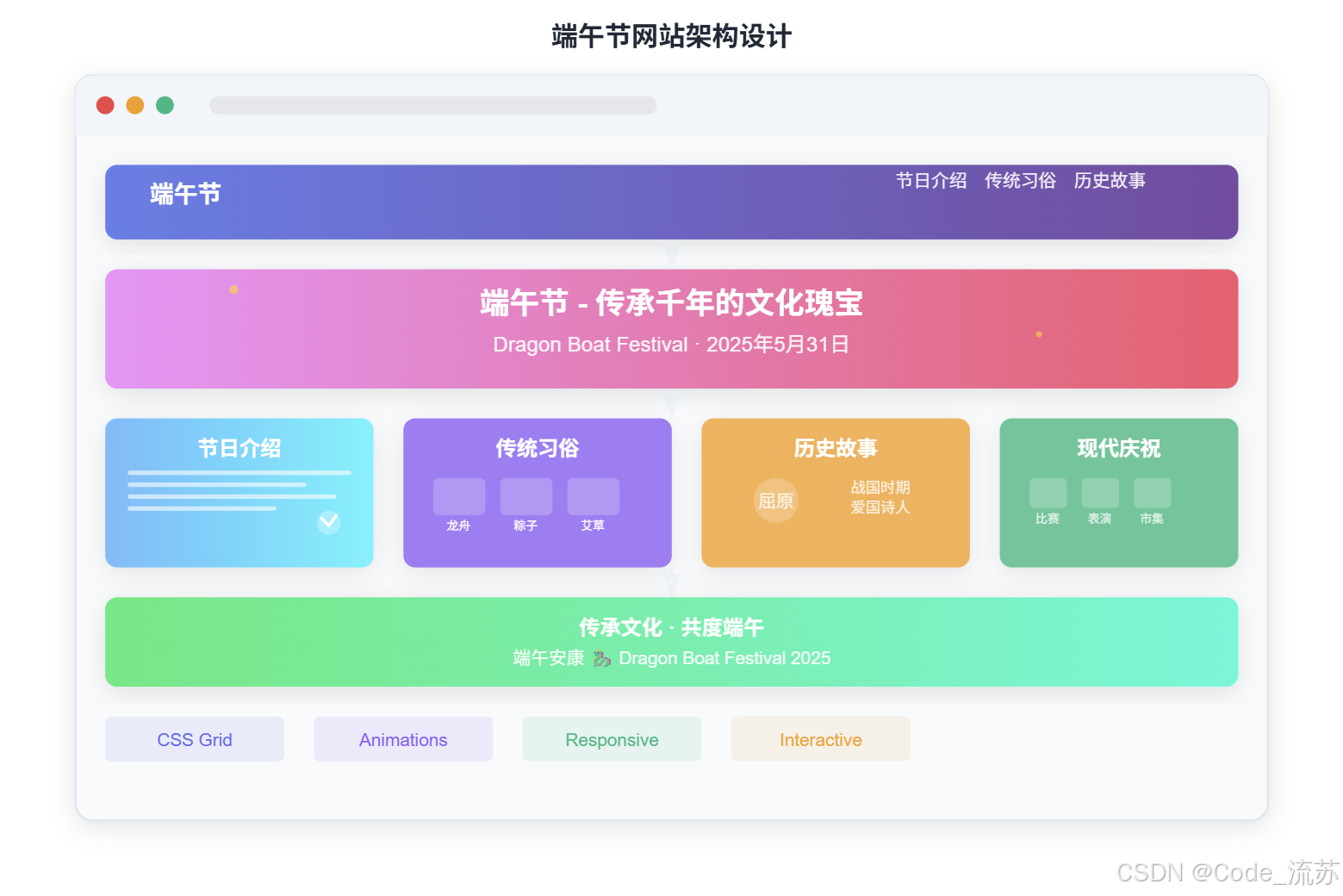
二、技术亮点深度解析
1. 响应式布局的精妙设计
网站采用移动优先的设计理念,通过CSS Grid和Flexbox实现完美的响应式布局:
.intro-content {
    display: grid;
    grid-template-columns: 1fr 1fr;
    gap: 4rem;
    align-items: center;
}

/* 移动端适配 */
@media (max-width: 768px) {
    .intro-content {
        grid-template-columns: 1fr;
        text-align: center;
    }
}
技术解读:
grid-template-columns: 1fr 1fr创建等宽双列布局- 移动端自动切换为单列,确保内容可读性
gap: 4rem提供适当的元素间距

2. CSS动画系统的巧妙运用
滚动触发动画
使用Intersection Observer API实现元素进入视口时的动画效果:
const observerOptions = {
    threshold: 0.1,
    rootMargin: '0px 0px -50px 0px'
};

const observer = new IntersectionObserver(function(entries) {
    entries.forEach(entry => {
        if (entry.isIntersecting) {
            entry.target.classList.add('visible');
        }
    });
}, observerOptions);
配合CSS过渡效果:
.fade-in {
    opacity: 0;
    transform: translateY(30px);
    transition: opacity 0.6s ease, transform 0.6s ease;
}

.fade-in.visible {
    opacity: 1;
    transform: translateY(0);
}
龙舟动画效果
创新性地用纯CSS实现龙舟摇摆动画:
.dragon-boat {
    animation: wave 3s ease-in-out infinite;
}

@keyframes wave {
    0%, 100% { transform: rotate(0deg) translateY(0); }
    50% { transform: rotate(2deg) translateY(-10px); }
}
3. 毛玻璃效果的现代视觉
导航栏采用backdrop-filter属性实现毛玻璃效果:
.navbar {
    background: rgba(139, 69, 19, 0.95);
    backdrop-filter: blur(10px);
}
兼容性考虑:
- 主流现代浏览器都支持
backdrop-filter - 提供降级方案,确保在不支持的浏览器中仍有良好表现
4. 粒子系统的动态效果
通过JavaScript动态创建粒子元素,营造节日氛围:
function createParticle() {
    const particle = document.createElement('div');
    particle.style.cssText = `
        position: fixed;
        width: 4px;
        height: 4px;
        background: #FFD700;
        border-radius: 50%;
        left: ${Math.random() * window.innerWidth}px;
        top: ${window.innerHeight}px;
        animation: rise 3s linear forwards;
    `;
    document.body.appendChild(particle);

    setTimeout(() => particle.remove(), 3000);
}
三、用户体验优化策略
1. 性能优化技巧
| 优化方向 | 具体措施 | 效果评估 |
|---|---|---|
| CSS性能 | 使用transform代替position变化 | 触发GPU加速 |
| JavaScript | 事件委托 + 防抖节流 | 减少事件监听器数量 |
| 动画优化 | will-change属性预告变化 | 提前开启硬件加速 |
| 资源加载 | 内联关键CSS | 减少首屏渲染时间 |
2. 交互设计亮点
导航栏智能变化
根据滚动位置动态调整导航栏透明度:
window.addEventListener('scroll', function() {
    const navbar = document.querySelector('.navbar');
    if (window.scrollY > 100) {
        navbar.style.background = 'rgba(139, 69, 19, 0.98)';
    } else {
        navbar.style.background = 'rgba(139, 69, 19, 0.95)';
    }
});
卡片点击反馈
为传统习俗卡片添加点击反馈效果:
document.querySelectorAll('.tradition-card').forEach(card => {
    card.addEventListener('click', function() {
        this.style.transform = 'scale(0.95)';
        setTimeout(() => {
            this.style.transform = '';
        }, 150);
    });
});
3. 无障碍访问优化
- 语义化HTML:正确使用
nav、section、article等标签 - 键盘导航:支持Tab键切换焦点
- 屏幕阅读器友好:合理的标题层级和alt属性
四、设计思路与色彩搭配
1. 中国传统色彩体系
网站采用中式配色方案,体现端午节的文化内涵:
:root {
    --primary-green: #2E8B57;    /* 主绿色 - 象征生命力 */
    --accent-gold: #FFD700;      /* 金黄色 - 寓意吉祥 */
    --brown-wood: #8B4513;       /* 棕木色 - 传统韵味 */
    --light-cream: #FFF8DC;      /* 米白色 - 温和背景 */
}
2. 视觉层次构建
通过渐变背景和阴影效果营造层次感:
.hero {
    background: linear-gradient(135deg, #2E8B57, #228B22, #32CD32);
}

.tradition-card {
    box-shadow: 0 10px 30px rgba(0,0,0,0.1);
    transition: transform 0.3s ease, box-shadow 0.3s ease;
}

.tradition-card:hover {
    transform: translateY(-10px);
    box-shadow: 0 20px 50px rgba(0,0,0,0.15);
}
五、移动端适配的细节考量
1. 响应式断点设计
/* 移动端优化 */
@media (max-width: 768px) {
    .hero h1 {
        font-size: 2.5rem;  /* 缩小标题字号 */
    }

    .nav-links {
        display: none;      /* 隐藏导航菜单 */
    }

    .dragon-boat {
        width: 250px;       /* 调整龙舟尺寸 */
        height: 120px;
    }
}
2. 触摸友好的交互设计
- 适当的点击区域:按钮和链接至少44px高度
- 触摸反馈:点击时提供视觉反馈
- 滑动友好:避免意外触发hover效果
六、SEO与可访问性优化
1. 搜索引擎优化
<title>端午节 - 传承千年的文化瑰宝</title>
<meta name="description" content="探索端午节的历史文化和传统习俗">
<meta name="keywords" content="端午节,龙舟节,屈原,粽子,传统文化">
2. 结构化数据标记
通过合理的HTML结构和语义化标签,提高搜索引擎理解度:
<article>
    <header>
        <h1>端午节</h1>
        <time datetime="2025-05-31">2025年5月31日</time>
    </header>
    <section>
        <!-- 内容区域 -->
    </section>
</article>
七、完整代码及预览图
<!--原创:Code_流苏(CSDN)-->
<!DOCTYPE html>
<html lang="zh-CN">
<head>
<meta charset="UTF-8">
<meta name="viewport" content="width=device-width, initial-scale=1.0">
<title>端午节 - 传承千年的文化瑰宝</title>
<style>
* {
margin: 0;
padding: 0;
box-sizing: border-box;
}
body {
font-family: 'Microsoft YaHei', Arial, sans-serif;
line-height: 1.6;
overflow-x: hidden;
}
/* 导航栏 */
.navbar {
position: fixed;
top: 0;
width: 100%;
background: rgba(139, 69, 19, 0.95);
backdrop-filter: blur(10px);
z-index: 1000;
padding: 1rem 0;
transition: all 0.3s ease;
}
.nav-container {
max-width: 1200px;
margin: 0 auto;
display: flex;
justify-content: space-between;
align-items: center;
padding: 0 2rem;
}
.logo {
font-size: 1.8rem;
font-weight: bold;
color: #FFD700;
text-decoration: none;
}
.nav-links {
display: flex;
list-style: none;
gap: 2rem;
}
.nav-links a {
color: white;
text-decoration: none;
font-weight: 500;
transition: color 0.3s ease;
position: relative;
}
.nav-links a:hover {
color: #FFD700;
}
.nav-links a::after {
content: '';
position: absolute;
width: 0;
height: 2px;
bottom: -5px;
left: 0;
background: #FFD700;
transition: width 0.3s ease;
}
.nav-links a:hover::after {
width: 100%;
}
/* 英雄区域 */
.hero {
height: 100vh;
background: linear-gradient(135deg, #2E8B57, #228B22, #32CD32);
display: flex;
align-items: center;
justify-content: center;
text-align: center;
color: white;
position: relative;
overflow: hidden;
}
.hero::before {
content: '';
position: absolute;
top: 0;
left: 0;
width: 100%;
height: 100%;
background: url('data:image/svg+xml,<svg xmlns="http://www.w3.org/2000/svg" viewBox="0 0 100 100"><path d="M50 10c-5 0-10 5-10 10s5 10 10 10 10-5 10-10-5-10-10-10z" fill="rgba(255,215,0,0.1)"/></svg>') repeat;
animation: float 20s infinite linear;
}
@keyframes float {
0% { transform: translateX(0) translateY(0); }
100% { transform: translateX(-100px) translateY(-100px); }
}
.hero-content {
z-index: 2;
max-width: 800px;
padding: 0 2rem;
}
.hero h1 {
font-size: 4rem;
margin-bottom: 1rem;
text-shadow: 2px 2px 4px rgba(0,0,0,0.3);
animation: slideInDown 1s ease-out;
}
.hero .subtitle {
font-size: 1.5rem;
margin-bottom: 2rem;
opacity: 0.9;
animation: slideInUp 1s ease-out 0.5s both;
}
.hero .date {
font-size: 2rem;
color: #FFD700;
font-weight: bold;
animation: pulse 2s infinite;
}
@keyframes slideInDown {
from {
opacity: 0;
transform: translateY(-50px);
}
to {
opacity: 1;
transform: translateY(0);
}
}
@keyframes slideInUp {
from {
opacity: 0;
transform: translateY(50px);
}
to {
opacity: 1;
transform: translateY(0);
}
}
@keyframes pulse {
0%, 100% { transform: scale(1); }
50% { transform: scale(1.05); }
}
/* 内容区域 */
.section {
padding: 5rem 0;
max-width: 1200px;
margin: 0 auto;
}
.container {
padding: 0 2rem;
}
.section-title {
text-align: center;
font-size: 3rem;
margin-bottom: 3rem;
color: #8B4513;
position: relative;
}
.section-title::after {
content: '';
position: absolute;
bottom: -10px;
left: 50%;
transform: translateX(-50%);
width: 100px;
height: 4px;
background: linear-gradient(90deg, #FFD700, #FFA500);
border-radius: 2px;
}
/* 介绍部分 */
.intro {
background: linear-gradient(135deg, #FFF8DC, #FFFACD);
}
.intro-content {
display: grid;
grid-template-columns: 1fr 1fr;
gap: 4rem;
align-items: center;
}
.intro-text {
font-size: 1.2rem;
line-height: 1.8;
color: #444;
}
.intro-image {
text-align: center;
}
.dragon-boat {
width: 300px;
height: 150px;
background-image: url('此处替换成你上传到图床的龙舟图片,举例:https://yueliusu.oss-cn-beijing.aliyuncs.com/img2/xxx.png');
background-size: contain;
background-repeat: no-repeat;
background-position: center;
margin: 2rem auto;
animation: wave 3s ease-in-out infinite;
}
@keyframes wave {
0%, 100% { transform: rotate(0deg) translateY(0); }
50% { transform: rotate(2deg) translateY(-10px); }
}
/* 传统习俗 */
.traditions {
background: #F0F8FF;
}
.traditions-grid {
display: grid;
grid-template-columns: repeat(auto-fit, minmax(300px, 1fr));
gap: 2rem;
margin-top: 3rem;
}
.tradition-card {
background: white;
padding: 2rem;
border-radius: 15px;
box-shadow: 0 10px 30px rgba(0,0,0,0.1);
text-align: center;
transition: transform 0.3s ease, box-shadow 0.3s ease;
cursor: pointer;
}
.tradition-card:hover {
transform: translateY(-10px);
box-shadow: 0 20px 50px rgba(0,0,0,0.15);
}
.tradition-icon {
font-size: 4rem;
margin-bottom: 1rem;
display: block;
}
.tradition-card h3 {
font-size: 1.5rem;
margin-bottom: 1rem;
color: #8B4513;
}
.tradition-card p {
color: #666;
line-height: 1.6;
}
/* 历史故事 */
.history {
background: linear-gradient(135deg, #E6E6FA, #DDA0DD);
}
.story-container {
background: white;
padding: 3rem;
border-radius: 20px;
box-shadow: 0 15px 35px rgba(0,0,0,0.1);
margin-top: 2rem;
}
.story-text {
font-size: 1.1rem;
line-height: 1.8;
color: #444;
text-align: justify;
}
.highlight {
background: linear-gradient(120deg, #FFD700, #FFA500);
color: white;
padding: 0.2rem 0.5rem;
border-radius: 5px;
font-weight: bold;
}
/* 现代庆祝 */
.modern {
background: #F5F5DC;
}
.celebration-grid {
display: grid;
grid-template-columns: repeat(auto-fit, minmax(250px, 1fr));
gap: 2rem;
margin-top: 3rem;
}
.celebration-item {
background: linear-gradient(145deg, #FFF, #F0F0F0);
padding: 2rem;
border-radius: 15px;
text-align: center;
border: 3px solid transparent;
background-clip: padding-box;
transition: all 0.3s ease;
}
.celebration-item:hover {
border-color: #FFD700;
transform: scale(1.05);
}
.celebration-item h4 {
color: #8B4513;
margin-bottom: 1rem;
font-size: 1.3rem;
}
/* 页脚 */
.footer {
background: linear-gradient(135deg, #8B4513, #A0522D);
color: white;
text-align: center;
padding: 3rem 0;
}
.footer-content {
max-width: 1200px;
margin: 0 auto;
padding: 0 2rem;
}
.footer h3 {
font-size: 2rem;
margin-bottom: 1rem;
color: #FFD700;
}
.footer p {
font-size: 1.1rem;
opacity: 0.9;
}
/* 响应式设计 */
@media (max-width: 768px) {
.hero h1 {
font-size: 2.5rem;
}
.hero .subtitle {
font-size: 1.2rem;
}
.intro-content {
grid-template-columns: 1fr;
text-align: center;
}
.nav-links {
display: none;
}
.section-title {
font-size: 2rem;
}
.dragon-boat {
width: 250px;
height: 120px;
}
}
/* 滚动动画 */
.fade-in {
opacity: 0;
transform: translateY(30px);
transition: opacity 0.6s ease, transform 0.6s ease;
}
.fade-in.visible {
opacity: 1;
transform: translateY(0);
}
</style>
</head>
<body>
<nav class="navbar">
<div class="nav-container">
<a href="#" class="logo">端午节</a>
<ul class="nav-links">
<li><a href="#intro">节日介绍</a></li>
<li><a href="#traditions">传统习俗</a></li>
<li><a href="#history">历史故事</a></li>
<li><a href="#modern">现代庆祝</a></li>
</ul>
</div>
</nav>
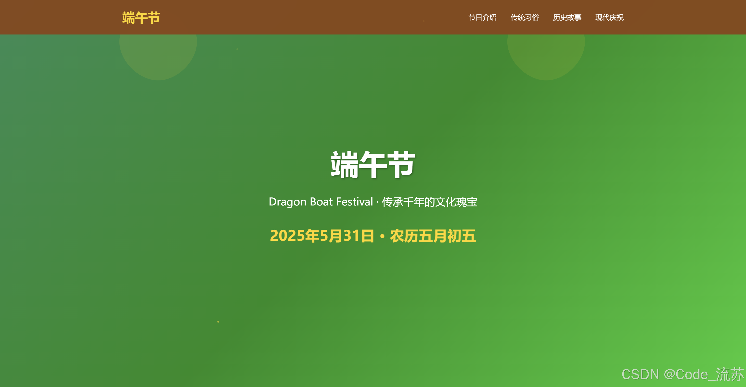
<section class="hero">
<div class="hero-content">
<h1>端午节</h1>
<p class="subtitle">Dragon Boat Festival · 传承千年的文化瑰宝</p>
<p class="date">2025年5月31日 · 农历五月初五</p>
</div>
</section>
<section id="intro" class="section intro">
<div class="container">
<h2 class="section-title fade-in">节日介绍</h2>
<div class="intro-content fade-in">
<div class="intro-text">
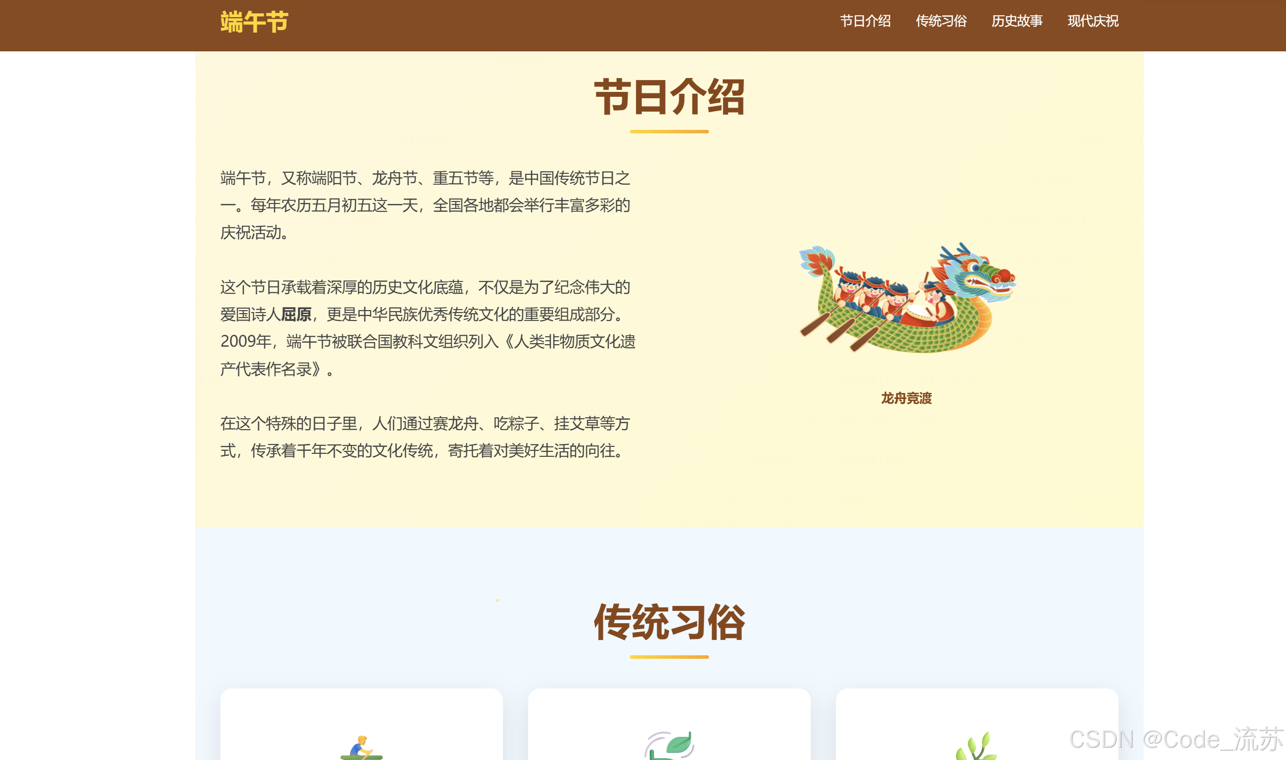
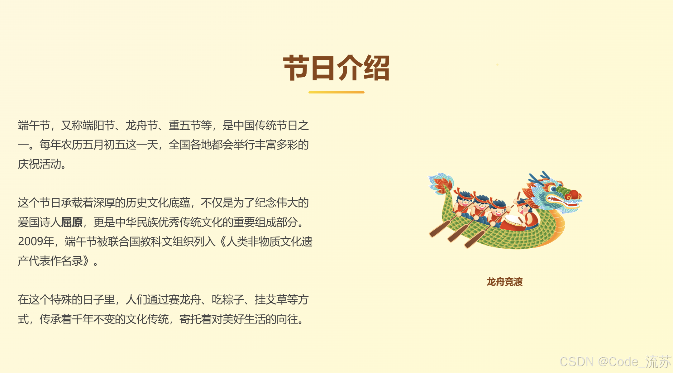
<p>端午节,又称端阳节、龙舟节、重五节等,是中国传统节日之一。每年农历五月初五这一天,全国各地都会举行丰富多彩的庆祝活动。</p>
<br>
<p>这个节日承载着深厚的历史文化底蕴,不仅是为了纪念伟大的爱国诗人<strong>屈原</strong>,更是中华民族优秀传统文化的重要组成部分。2009年,端午节被联合国教科文组织列入《人类非物质文化遗产代表作名录》。</p>
<br>
<p>在这个特殊的日子里,人们通过赛龙舟、吃粽子、挂艾草等方式,传承着千年不变的文化传统,寄托着对美好生活的向往。</p>
</div>
<div class="intro-image">
<div class="dragon-boat"></div>
<p style="color: #8B4513; font-weight: bold; margin-top: 1rem;">龙舟竞渡</p>
</div>
</div>
</div>
</section>
<section id="traditions" class="section traditions">
<div class="container">
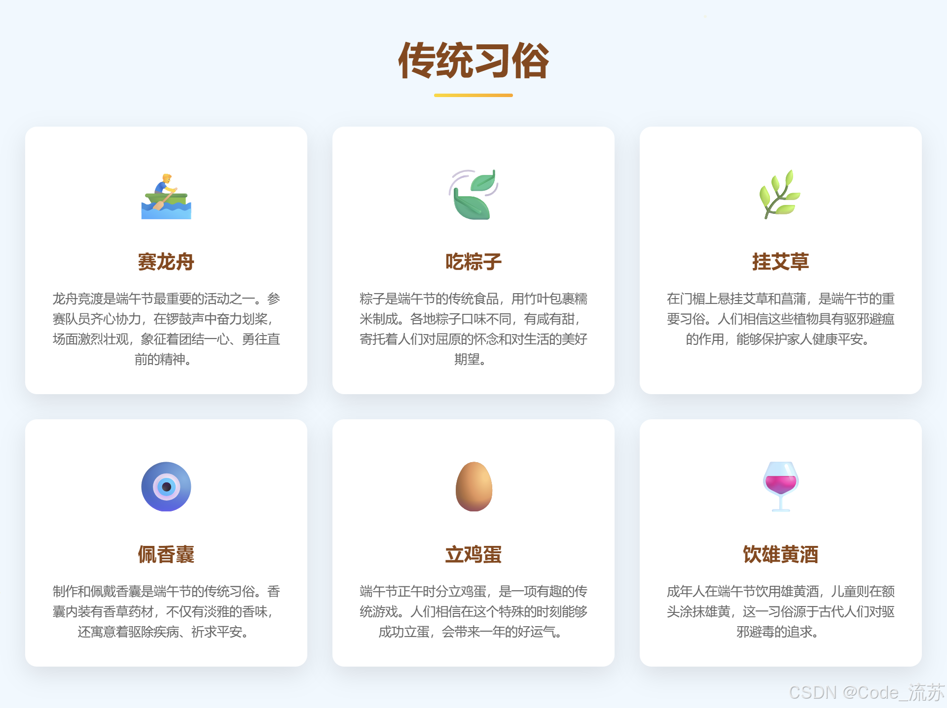
<h2 class="section-title fade-in">传统习俗</h2>
<div class="traditions-grid fade-in">
<div class="tradition-card">
<span class="tradition-icon">🚣♂️</span>
<h3>赛龙舟</h3>
<p>龙舟竞渡是端午节最重要的活动之一。参赛队员齐心协力,在锣鼓声中奋力划桨,场面激烈壮观,象征着团结一心、勇往直前的精神。</p>
</div>
<div class="tradition-card">
<span class="tradition-icon">🍃</span>
<h3>吃粽子</h3>
<p>粽子是端午节的传统食品,用竹叶包裹糯米制成。各地粽子口味不同,有咸有甜,寄托着人们对屈原的怀念和对生活的美好期望。</p>
</div>
<div class="tradition-card">
<span class="tradition-icon">🌿</span>
<h3>挂艾草</h3>
<p>在门楣上悬挂艾草和菖蒲,是端午节的重要习俗。人们相信这些植物具有驱邪避瘟的作用,能够保护家人健康平安。</p>
</div>
<div class="tradition-card">
<span class="tradition-icon">🧿</span>
<h3>佩香囊</h3>
<p>制作和佩戴香囊是端午节的传统习俗。香囊内装有香草药材,不仅有淡雅的香味,还寓意着驱除疾病、祈求平安。</p>
</div>
<div class="tradition-card">
<span class="tradition-icon">🥚</span>
<h3>立鸡蛋</h3>
<p>端午节正午时分立鸡蛋,是一项有趣的传统游戏。人们相信在这个特殊的时刻能够成功立蛋,会带来一年的好运气。</p>
</div>
<div class="tradition-card">
<span class="tradition-icon">🍷</span>
<h3>饮雄黄酒</h3>
<p>成年人在端午节饮用雄黄酒,儿童则在额头涂抹雄黄,这一习俗源于古代人们对驱邪避毒的追求。</p>
</div>
</div>
</div>
</section>
<section id="history" class="section history">
<div class="container">
<h2 class="section-title fade-in">历史故事</h2>
<div class="story-container fade-in">
<div class="story-text">
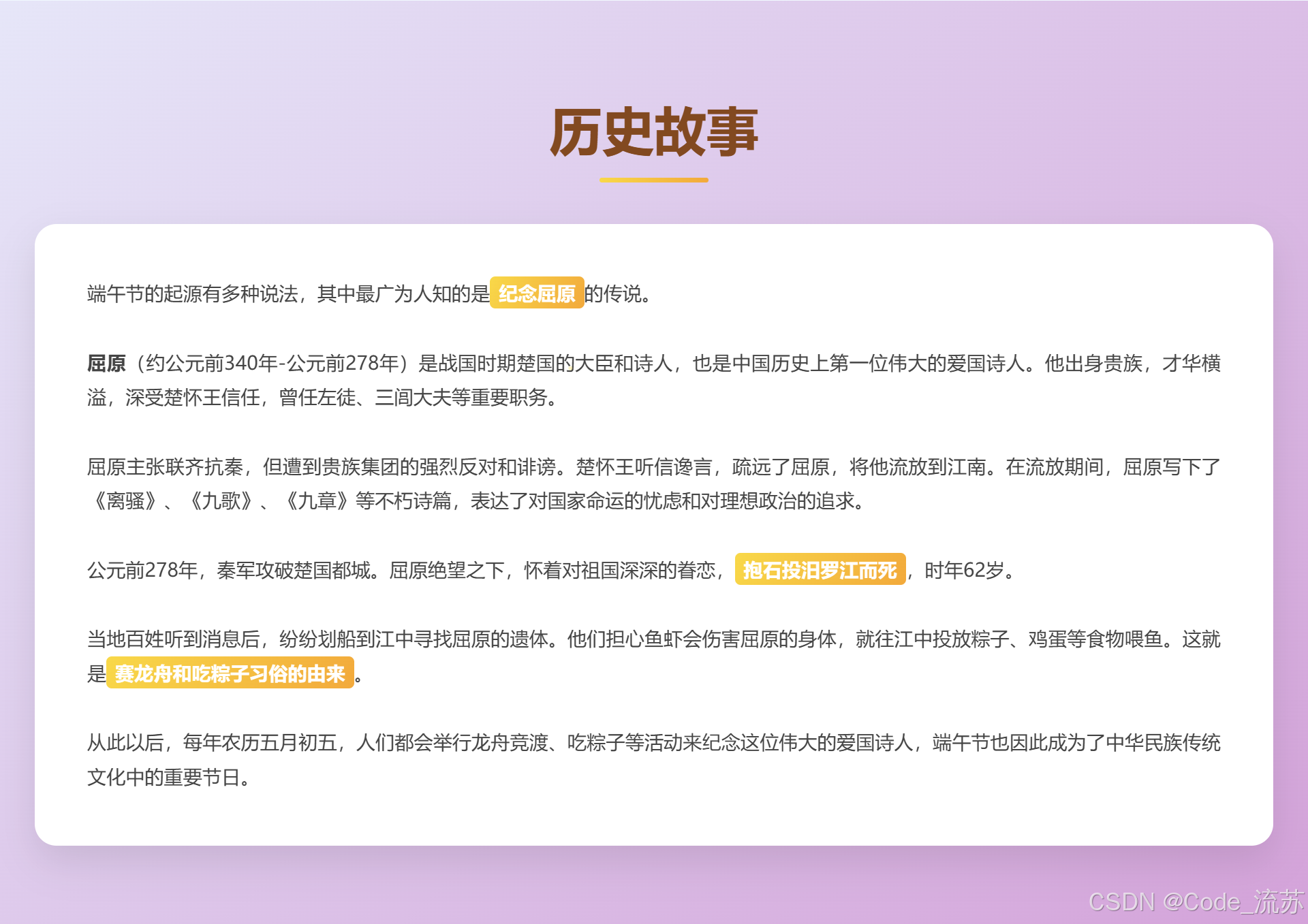
<p>端午节的起源有多种说法,其中最广为人知的是<span class="highlight">纪念屈原</span>的传说。</p>
<br>
<p><strong>屈原</strong>(约公元前340年-公元前278年)是战国时期楚国的大臣和诗人,也是中国历史上第一位伟大的爱国诗人。他出身贵族,才华横溢,深受楚怀王信任,曾任左徒、三闾大夫等重要职务。</p>
<br>
<p>屈原主张联齐抗秦,但遭到贵族集团的强烈反对和诽谤。楚怀王听信谗言,疏远了屈原,将他流放到江南。在流放期间,屈原写下了《离骚》、《九歌》、《九章》等不朽诗篇,表达了对国家命运的忧虑和对理想政治的追求。</p>
<br>
<p>公元前278年,秦军攻破楚国都城。屈原绝望之下,怀着对祖国深深的眷恋,<span class="highlight">抱石投汨罗江而死</span>,时年62岁。</p>
<br>
<p>当地百姓听到消息后,纷纷划船到江中寻找屈原的遗体。他们担心鱼虾会伤害屈原的身体,就往江中投放粽子、鸡蛋等食物喂鱼。这就是<span class="highlight">赛龙舟和吃粽子习俗的由来</span>。</p>
<br>
<p>从此以后,每年农历五月初五,人们都会举行龙舟竞渡、吃粽子等活动来纪念这位伟大的爱国诗人,端午节也因此成为了中华民族传统文化中的重要节日。</p>
</div>
</div>
</div>
</section>
<section id="modern" class="section modern">
<div class="container">
<h2 class="section-title fade-in">现代庆祝</h2>
<div class="celebration-grid fade-in">
<div class="celebration-item">
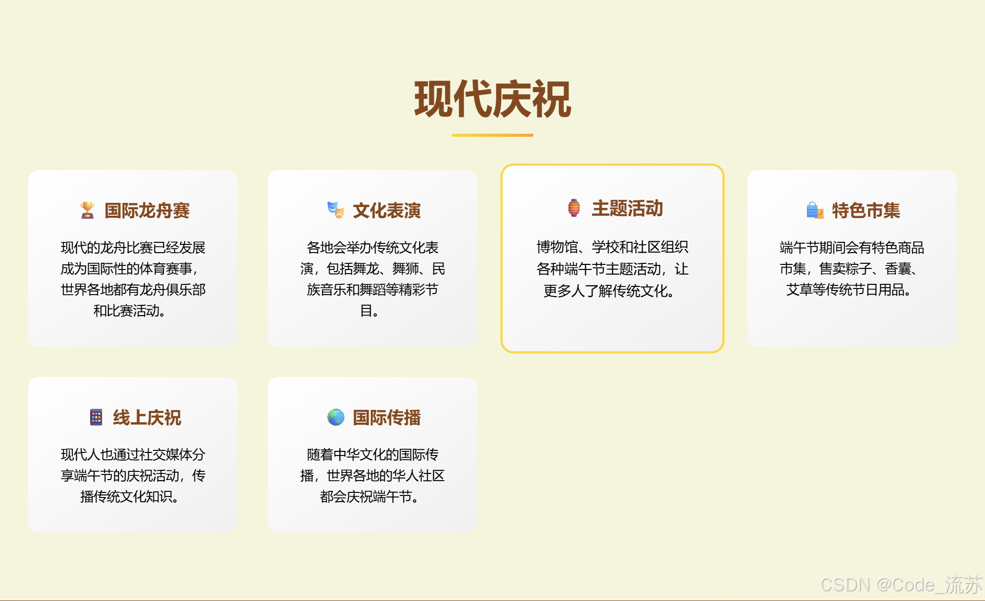
<h4>🏆 国际龙舟赛</h4>
<p>现代的龙舟比赛已经发展成为国际性的体育赛事,世界各地都有龙舟俱乐部和比赛活动。</p>
</div>
<div class="celebration-item">
<h4>🎭 文化表演</h4>
<p>各地会举办传统文化表演,包括舞龙、舞狮、民族音乐和舞蹈等精彩节目。</p>
</div>
<div class="celebration-item">
<h4>🏮 主题活动</h4>
<p>博物馆、学校和社区组织各种端午节主题活动,让更多人了解传统文化。</p>
</div>
<div class="celebration-item">
<h4>🛍️ 特色市集</h4>
<p>端午节期间会有特色商品市集,售卖粽子、香囊、艾草等传统节日用品。</p>
</div>
<div class="celebration-item">
<h4>📱 线上庆祝</h4>
<p>现代人也通过社交媒体分享端午节的庆祝活动,传播传统文化知识。</p>
</div>
<div class="celebration-item">
<h4>🌏 国际传播</h4>
<p>随着中华文化的国际传播,世界各地的华人社区都会庆祝端午节。</p>
</div>
</div>
</div>
</section>
<footer class="footer">
<div class="footer-content">
<h3>传承文化 · 共度端午</h3>
<p>愿这个端午节带给您和家人健康、快乐与平安!</p>
<p style="margin-top: 2rem; opacity: 0.7;">端午安康 🐉 Dragon Boat Festival 2025</p>
</div>
</footer>
<script>
// 平滑滚动
document.querySelectorAll('a[href^="#"]').forEach(anchor => {
anchor.addEventListener('click', function (e) {
e.preventDefault();
const target = document.querySelector(this.getAttribute('href'));
if (target) {
target.scrollIntoView({
behavior: 'smooth',
block: 'start'
});
}
});
});
// 滚动动画
const observerOptions = {
threshold: 0.1,
rootMargin: '0px 0px -50px 0px'
};
const observer = new IntersectionObserver(function(entries) {
entries.forEach(entry => {
if (entry.isIntersecting) {
entry.target.classList.add('visible');
}
});
}, observerOptions);
// 观察所有需要动画的元素
document.querySelectorAll('.fade-in').forEach(el => {
observer.observe(el);
});
// 导航栏滚动效果
window.addEventListener('scroll', function() {
const navbar = document.querySelector('.navbar');
if (window.scrollY > 100) {
navbar.style.background = 'rgba(139, 69, 19, 0.98)';
} else {
navbar.style.background = 'rgba(139, 69, 19, 0.95)';
}
});
// 卡片点击效果
document.querySelectorAll('.tradition-card').forEach(card => {
card.addEventListener('click', function() {
this.style.transform = 'scale(0.95)';
setTimeout(() => {
this.style.transform = '';
}, 150);
});
});
// 添加粒子效果(可选)
function createParticle() {
const particle = document.createElement('div');
particle.style.cssText = `
position: fixed;
width: 4px;
height: 4px;
background: #FFD700;
border-radius: 50%;
pointer-events: none;
z-index: 1000;
opacity: 0.7;
left: ${Math.random() * window.innerWidth}px;
top: ${window.innerHeight}px;
animation: rise 3s linear forwards;
`;
document.body.appendChild(particle);
setTimeout(() => {
particle.remove();
}, 3000);
}
// 添加CSS动画
const style = document.createElement('style');
style.textContent = `
@keyframes rise {
to {
transform: translateY(-${window.innerHeight + 50}px) rotate(360deg);
opacity: 0;
}
}
`;
document.head.appendChild(style);
// 定期创建粒子效果
setInterval(createParticle, 2000);
</script>
</body>
</html>
图片预览:

八、总结与技术启示
1️⃣关键技术收获
- CSS Grid + Flexbox的组合使用,实现灵活的响应式布局
- Intersection Observer API提供了高性能的滚动动画解决方案
- CSS动画与JavaScript交互的有机结合,创造出丰富的视觉效果
- 移动优先的设计理念,确保多端一致的用户体验
2️⃣技术发展趋势
随着Web技术的不断发展,我们可以期待:
- CSS容器查询将带来更精细的响应式控制
- Web动画API将提供更强大的动画能力
- Progressive Web App技术将进一步提升用户体验
通过这个项目,我们不仅学到了前端技术的实际应用,更重要的是理解了如何用技术手段传承和发扬传统文化。在数字化时代,每一位开发者都可以成为文化传承的使者!
源码获取:完整代码已在文章中展示,可直接复制使用。
技术交流:欢迎在评论区分享你的优化建议和创意想法!
创作者:Code_流苏(CSDN)(一个喜欢古诗词和编程的Coder😊)
转载自CSDN-专业IT技术社区
© Code_流苏(CSDN) | 未经允许禁止转载 | 禁止商用及未授权修改 | 私自转载商用将通过法律维护权益
原文链接:https://blog.csdn.net/qq_51646682/article/details/148353150