原文链接:https://mp.weixin.qq.com/s/XT1Wg-hqZJxJ4_letCdoaA
本期文章
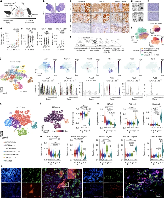
**题目:**Basal cell of origin resolves neuroendocrine–tuft lineage plasticity in cancer
**期刊:**Nature
online: 2025年9于17日
**第一单位:**美国北卡罗来纳州杜克大学药理学和癌症生物学系
摘要
神经内分泌和簇状细胞分别是由 ASCL1 和 POU2F3 转录因子表达定义的罕见化学感觉上皮谱系。神经内分泌癌症,包括小细胞肺癌 (SCLC), 经常表现出簇状亚群,这一特征与不良的患者预后有关 1,2,3,4,5,6,7,8,9。驱动神经内分泌 - 簇状肿瘤异质性和簇状癌起源的机制尚不清楚。使用多个基因工程动物 SCLC 模型,我们证明起源于基底细胞 (但不是公认的神经内分泌起源) 的神经内分泌 - 簇状肿瘤高度重现人类 SCLC。基底衍生的 SCLC 的单细胞克隆分析进一步揭示了意外的转录状态,包括 Atoh1 + 状态,以及神经内分泌 - 簇状可塑性背后的谱系轨迹。在基底细胞中,富集在人类簇状 SCLC 中的遗传改变 (包括高 MYC、PTEN 丢失和 ASCL1 抑制) 的引入协同促进簇状肿瘤。944 个人类 SCLCs 的转录组学研究揭示了一个基底样亚群和簇状离子细胞样状态,这共同表明癌症状态与正常基底细胞损伤反应机制之间存在显著的保守性 10,11,12,13。总之,这些数据表明,基底细胞是 SCLCs 和其他神经内分泌簇状癌症的可能起源,这些癌症可以解释神经内分泌簇状异质性,为靶向谱系可塑性提供了新的见解。
Data availability

Code availability
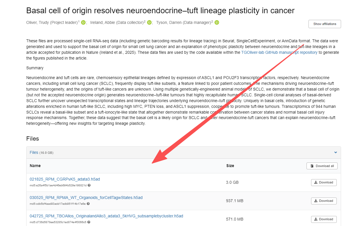
作者提供了文章分析代码和数据,可以直接在Github或Zenodo中下载。
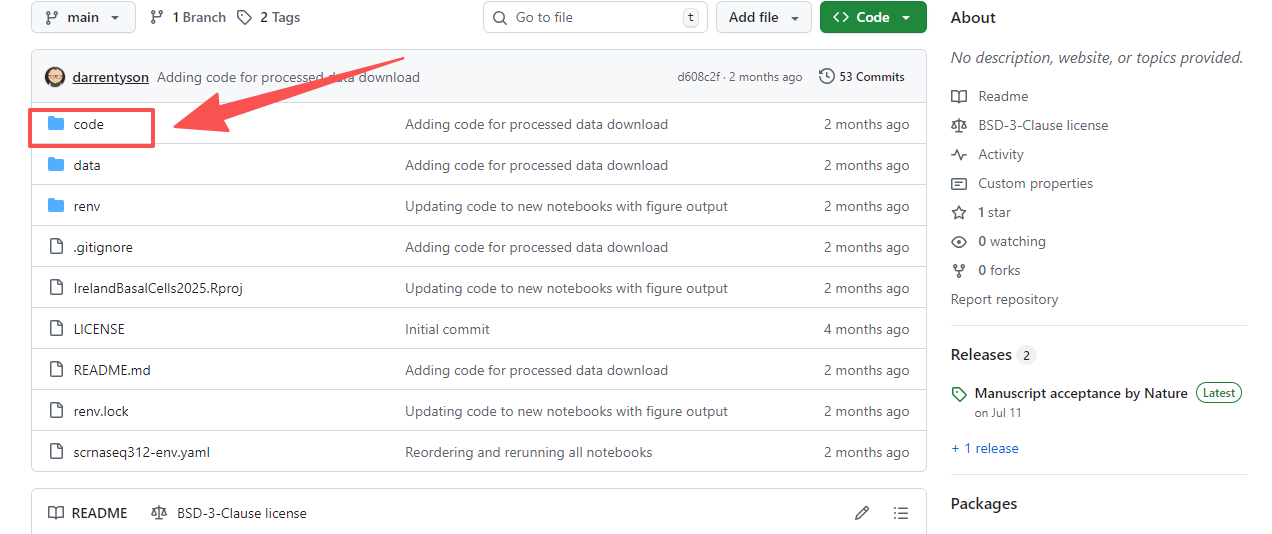
在Zenodo中的数据较大,可结合自己的需求下载。
如需本文的
Github中分析代码,可以在后台回复关键词:20250925
作者提供的代码非常详细,都会以html或ipynb的格式记录。每张图,都有详细分析或绘制过程。
在这里我们放其中一个绘图代码:
Related to:
- Fig 2e-l
- Fig 5d-h
- Extended Data Fig 5c,e
- Extended Data Fig 6a
- Extended Data Fig 10e
suppressPackageStartupMessages({
    library(Seurat)
    library(SeuratObject)
    library(SummarizedExperiment)
    library(ggplot2)
    library(ggpubr)
})
Load the Seurat object and CellTag clones
TBO_seurat<-readRDS("../data/07_2025_RPM_RPMA_TBO_CellTag_Seurat_wSigs_FA_dpt_final.rds")
TBO_seurat

clones <- readRDS("../data/05_2025_RPM_RPMA_TBOAllo_CellTagClones_Onlyclones.rds")
clones
Define color palettes
my_colors <- c(
  "#E41A1C", # strong red
  "#377EB8", # medium blue
  "#4DAF4A", # green
  "#984EA3", # purple
  "#FF7F00", # orange
  "#FFFF33", # yellow
  "#A65628", # brown
  "#e7298a", # pink
  "#666666", # grey
  "#66C2A5", # teal
  "#FC8D62", # salmon
  "#8DA0CB", # soft blue
  "#E78AC3", # soft pink (different from 8)
  "#A6D854", # light green (but yellowish tint, not green)
  "#FFD92F", # lemon yellow
  "#E5C494", # light brown
  "#B3B3B3", # light grey
  "#1B9E77", # deep teal
  "#D95F02", # dark orange
  "#7570B3", # strong purple
  "#66A61E"  # olive green (NOT same green as before)
)
Define function to plot violin plots by phenotype
Copied from 02_WT_RPM_Organoids_Allografts_notebook.Rmd. Needs SingleCellExperiment sce object and pheno_pairs_list defined in the notebook.
plotVlnByPhen <- function(feature, yl=c(-0.1,0.3), focus=NA) {
    if(!is.na(focus)) {
        pheno_pairs_list <- pheno_pairs_list[sapply(pheno_pairs_list, function(x) focus %in% x)]
    }

    scater::plotColData(sce, x = "Pheno", y = feature, colour_by = "Pheno") +
        scale_discrete_manual(aesthetics = c("colour", "fill"), values=pheno_col) +
        theme(axis.title.y = element_text(size = 24), axis.text.y = element_text(size = 16),
              axis.text.x = element_blank(),   # rotate x-axis labels
              plot.title = element_blank(),    # remove plot title
              legend.position = "none"         # remove legend
        ) + labs(x = "",                     # custom x-axis title
                 y = "Signature score"        # custom y-axis title
        ) + ylim(yl[1], yl[2]) +
        geom_boxplot(fill=pheno_col, alpha=1/5, position = position_dodge(width = .2),
                     size=0.2, color="black", notch=TRUE, notchwidth=0.3, outlier.shape = 2, outlier.colour=NA) # +
        # stat_summary(fun = mean,
        #              geom = "point",
        #              shape = 18,
        #              size = 2,
        #              color = "red",
        #              position = position_dodge(width = 0.5)) +
        # ggpubr::stat_compare_means(method = "wilcox.test", label = "p.signif", size=4,
        #                            vjust = 0.5,
        #                            hide.ns = TRUE, comparisons = pheno_pairs_list)
}
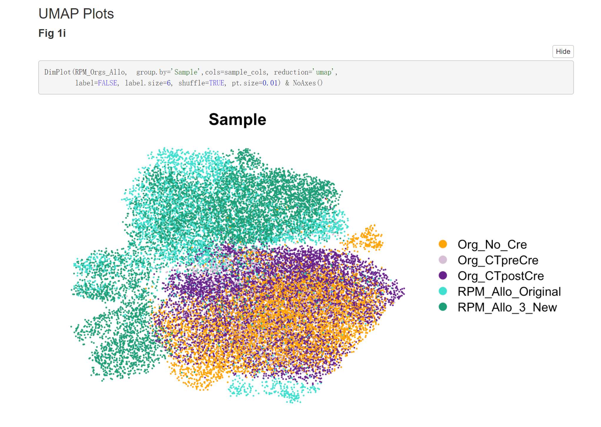
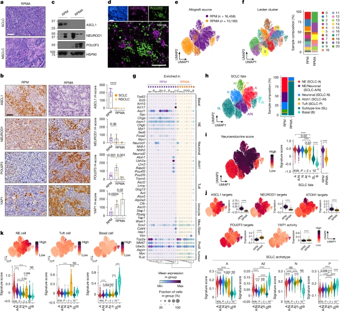
Fig. 2e UMAP
DimPlot(TBO_seurat, group.by='Genotype', cols=c("darkorchid4","orange"),
        pt.size = 0.1,
        reduction='umap', label=FALSE, label.size=7, shuffle=TRUE) & NoAxes()
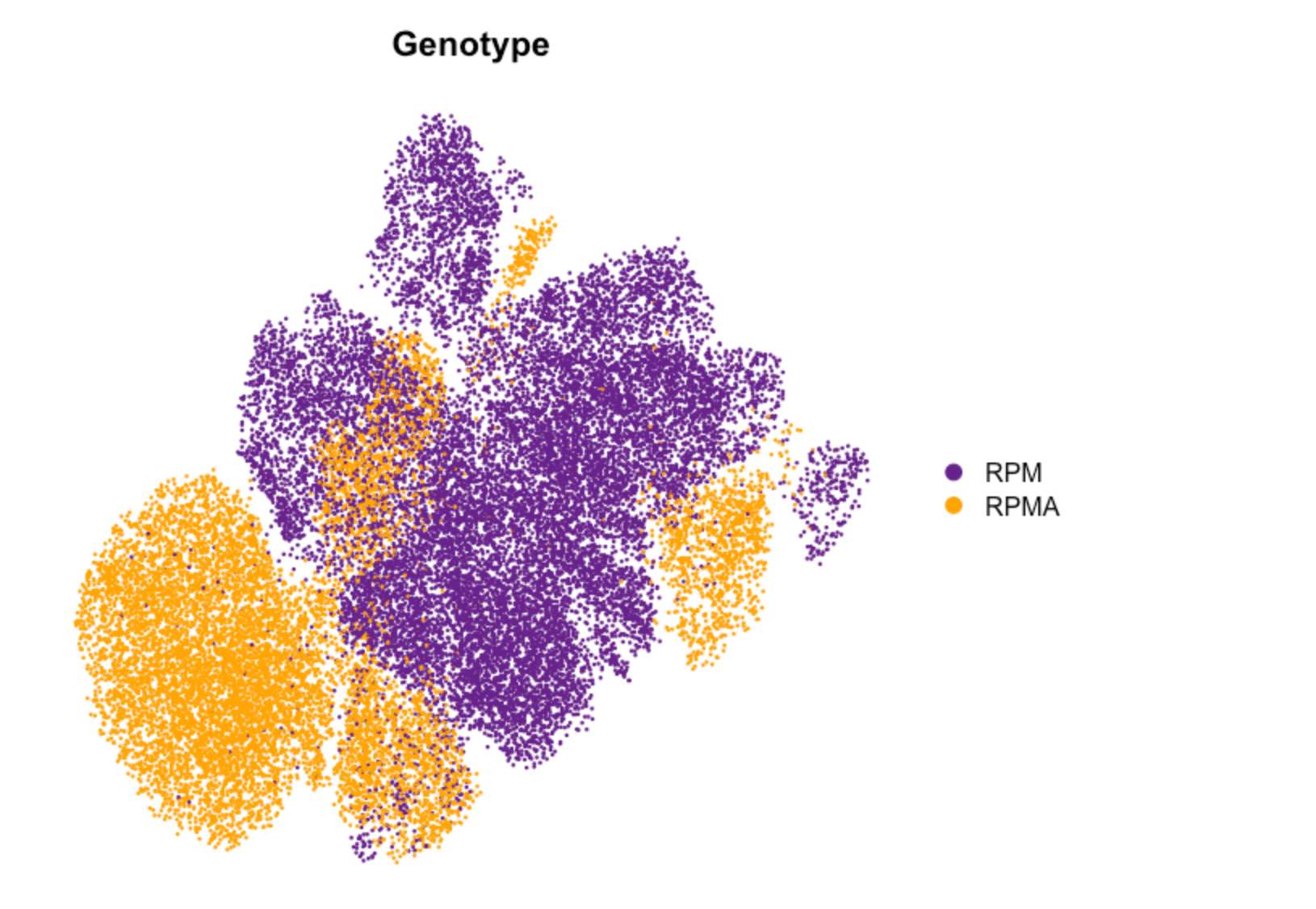
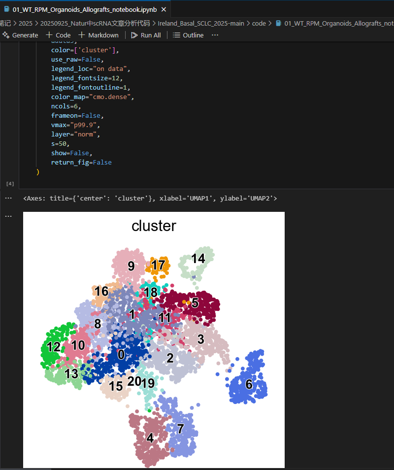
Fig. 2f (UMAP by Leiden cluster)
DimPlot(TBO_seurat, group.by='leiden_scVI_1.2',
        cols=my_colors, reduction='umap', label=TRUE, label.size=5,
        pt.size = 0.1) & NoAxes() +
    theme(legend.position="none")
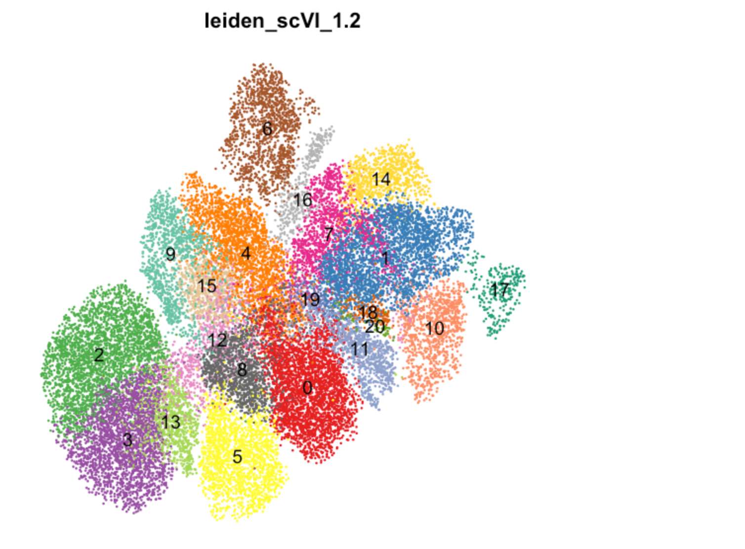
Idents(TBO_seurat) <- 'leiden_scVI_1.2'

x <- table([email protected]$Genotype,Idents(TBO_seurat))
proportions <- as.data.frame(100*prop.table(x, margin = 1))

colnames(proportions) <- c("Sample", "Cluster", "Frequency")

# ggpubr::ggbarplot(proportions, x="Sample", y="Frequency", fill = "Sample", group = "Sample",
#                   ylab = "Frequency (percent)", xlab="Phase", palette =c("indianred3","green3","royalblue4")) +
#     theme_bw() + facet_wrap(facets = "Cluster", scales="free_y", ncol =4) +
#     theme(axis.text.y = element_text(size=6)) + ggpubr::rotate_x_text(angle = 45)
Fig 2f
# Stacked
p <- ggplot(proportions, aes(fill=Cluster, y=Frequency, x=Sample)) +
    geom_bar(position="stack", stat="identity")

p + scale_fill_manual(values=my_colors) + theme_bw() +
    theme(axis.text.y = element_text(size=16),
          axis.text.x = element_text(size=16, angle = 90, vjust = 0.5, hjust=1),
          axis.title.x = element_text(size=16), axis.title.y = element_text(size=16),
          legend.text = element_text(size=12), legend.title = element_blank()) +
    labs(x = NULL, y = "Sample composition (%)")
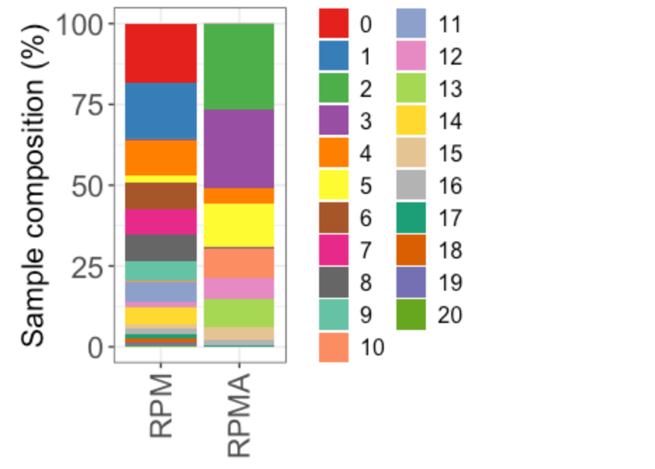
Fig. 2h
UMAP colored by SCLC fate
# Define fate color vector and use to plot by cell state
pheno_col <- c("brown2","darkorchid4","dodgerblue","#66A61E","orange","turquoise4","turquoise")
DimPlot(TBO_seurat, group.by='Pheno', cols=pheno_col, reduction='umap', label=FALSE,
        shuffle=TRUE, label.size=6) & NoAxes()
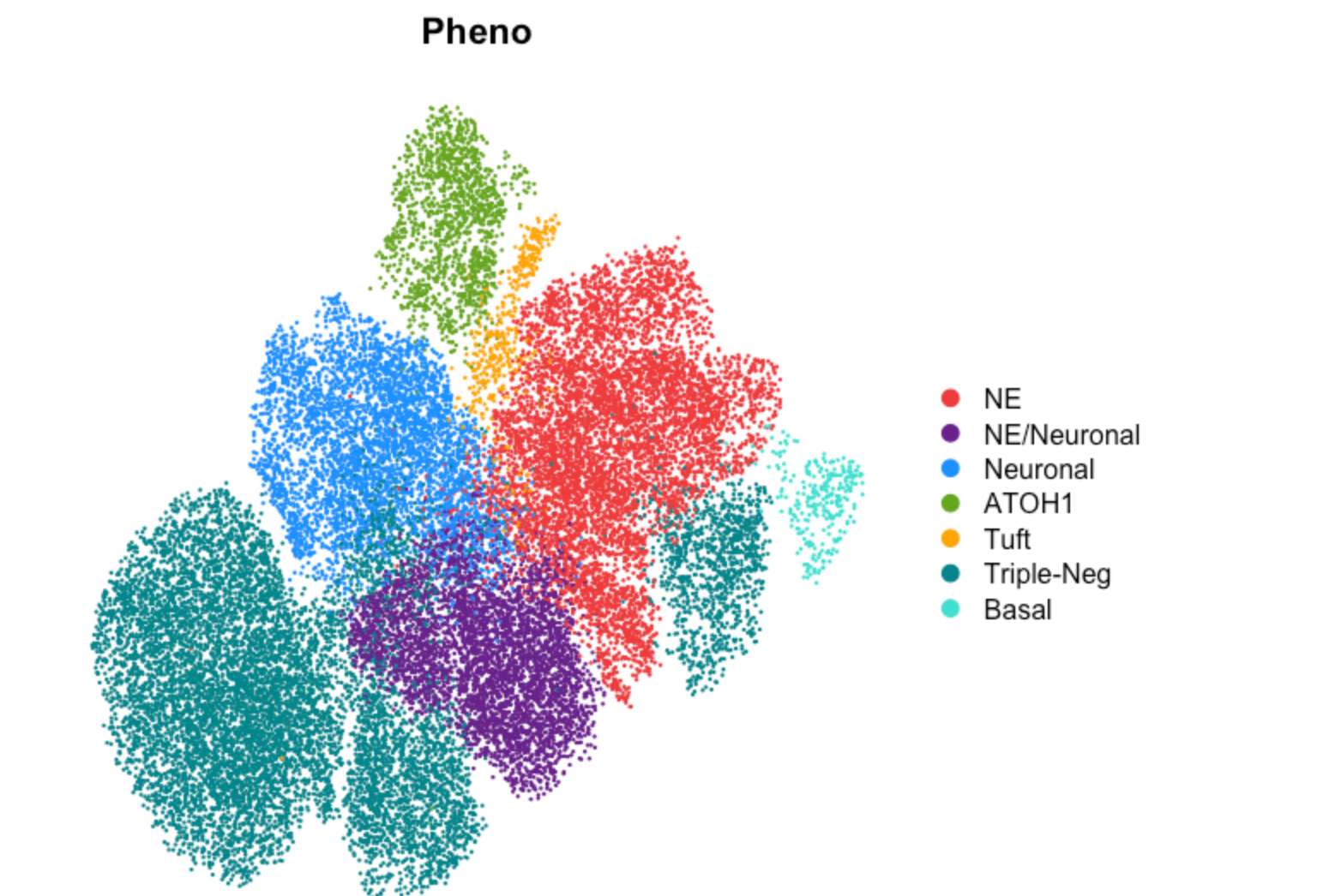
Fig. 2h (stacked barplot by Pheno)
Idents(TBO_seurat) <-'Pheno'

x <- table([email protected]$Genotype,Idents(TBO_seurat))
proportions <- as.data.frame(100*prop.table(x, margin = 1))

colnames(proportions)<-c("Cluster", "Sample", "Frequency")

p <- ggplot(proportions, aes(fill=Sample, y=Frequency, x=Cluster)) +
    geom_bar(position="stack", stat="identity")

p + scale_fill_manual(values=pheno_col) + theme_bw() +
    theme(axis.text.y = element_text(size=20),
          axis.text.x=element_text(size=20, angle = 90, hjust = 1, vjust = 0.5),
          axis.title.x = element_text(size=20), axis.title.y = element_text(size=20),
          legend.text = element_text(size=20), legend.title = element_text(size=20)) +
    labs(x = NULL)
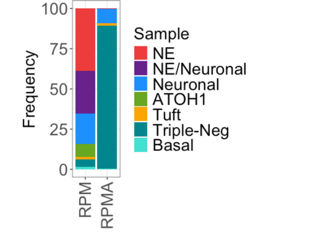
Fig. 2i UMAP
FeaturePlot(TBO_seurat, features = c("NE_spearman"), pt.size=0.2,
            reduction='umap') + viridis::scale_color_viridis(option="rocket",direction=-1) & NoAxes()
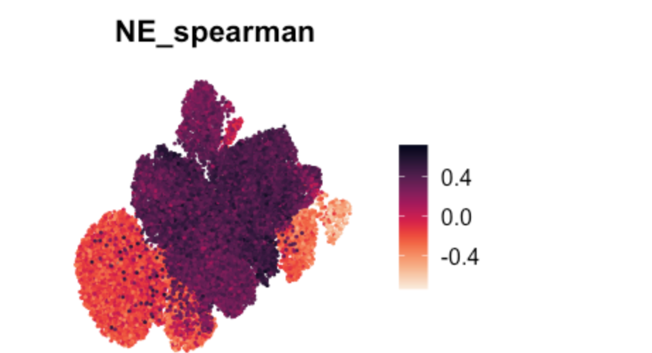
Fig 2i (violin plots of NE score by SCLC fate)
plotVlnByPhen("NE_spearman", yl=c(-.7, .8))
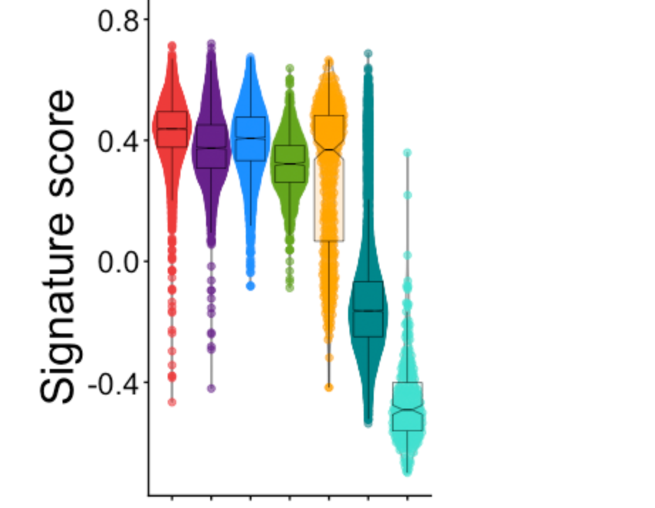
Fig 2i (violin plots of NE score by genotype)
x <- scater::plotColData(sce, x = "Genotype", y = "NE_spearman", colour_by = "Genotype") +
    scale_discrete_manual(aesthetics = c("colour", "fill"), values=c("darkorchid4","orange"))

x <- x + theme(axis.title.y = element_text(size = 24),axis.text.y = element_text(size = 16),
               axis.text.x = element_blank(),
               # plot.title = element_blank(),
               legend.position = "none") + labs(x = "",  y = "Signature score") +  ylim(-1,1) +
    geom_boxplot(fill=c("darkorchid4","orange"), alpha=1/5,
                 position = position_dodge(width = .2), size=0.2,
                 color="black", notch=TRUE, notchwidth=0.3, outlier.shape = 2, outlier.colour=NA)

## Perform wilcoxon rank-sum test for RPM vs RPMA on the NE score data (Fig. 3i) ##
x + stat_summary(fun = mean,
                 geom = "point",
                 shape = 18,
                 size = 2,
                 color = "red",
                 position = position_dodge(width = 0.9)) +
    ggpubr::stat_compare_means(method = "wilcox.test",label = "p.signif",
                               hide.ns = TRUE,comparisons = list(c("RPM", "RPMA")))
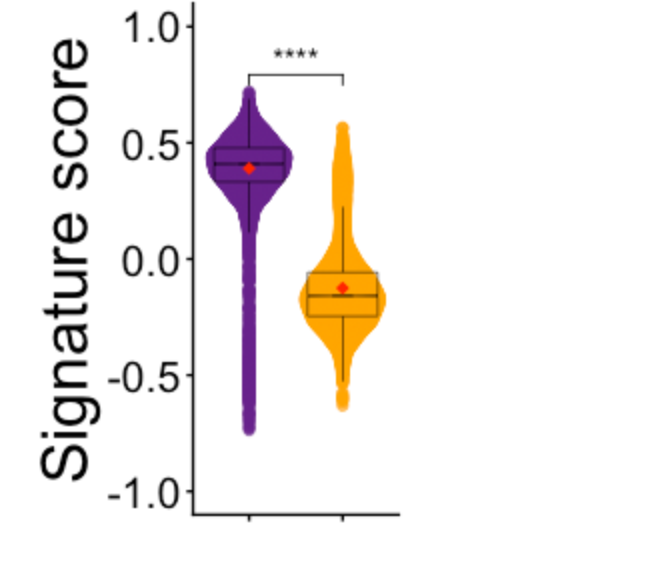
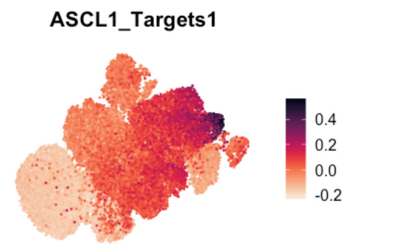
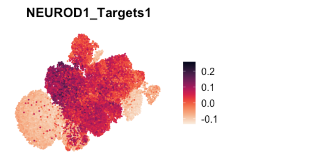
Fig 2j (UMAP marker gene expression)
# TF target gene scores in UMAP
FeaturePlot(TBO_seurat, features = c("ASCL1_Targets1"), pt.size=0.2,
            reduction='umap') + viridis::scale_color_viridis(option="rocket",direction=-1) & NoAxes()
FeaturePlot(TBO_seurat, features = c("NEUROD1_Targets1"), pt.size=0.2,
            reduction='umap') + viridis::scale_color_viridis(option="rocket",direction=-1) & NoAxes()
如需本文的
Github中分析代码,可以在后台回复关键词:20250925
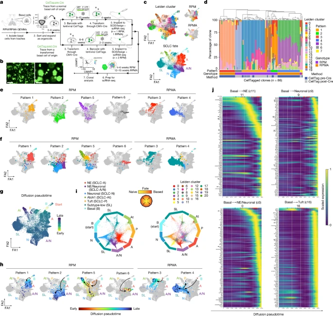
文章结果内容
1. Basal cells permit SCLC subtype diversity
2. Basal organoids model all SCLC subtypes
3. Lineage tracing reveals SCLC trajectories
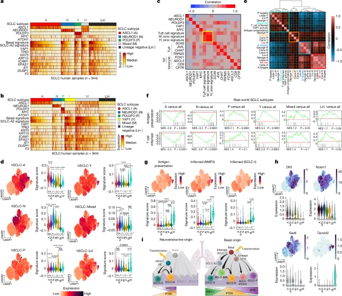
4. Inflammatory basal state of human SCLC
如需本文的
Github中分析代码,可以在后台回复关键词:20250925
若我们的教程对你有所帮助,请点赞+收藏+转发,大家的支持是我们更新的动力!!
2024已离你我而去,2025加油!!
往期部分文章
1. 最全WGCNA教程(替换数据即可出全部结果与图形)
推荐大家购买最新的教程,若是已经购买以前WGNCA教程的同学,可以在对应教程留言,即可获得最新的教程。(注:此教程也仅基于自己理解,不仅局限于此,难免有不恰当地方,请结合自己需求,进行改动。)
2. 精美图形绘制教程
3. 转录组分析教程
4. 转录组下游分析
BioinfoR生信筆記 ,注于分享生物信息学相关知识和R语言绘图教程。
转载自CSDN-专业IT技术社区
原文链接:https://blog.csdn.net/kanghua_du/article/details/152077648