
文章目录
一、整体结构:入口页的三合一布局
@Entry
@Component
struct AdvancedTabsDemo {
  @State currentSection: number = 0;
  private sections: string[] = ['滚动标签栏', '自定义 TabBar', '侧边导航'];

  build() {
    Column() {
      // 顶部导航栏
      Row() {
        SymbolGlyph($r('sys.symbol.arrow_left'))
          .fontSize(22)
          .fontColor(['#1A1A1A'])
          .padding(8)
          .onClick(() => { router.back(); })

        Text('高级标签栏特性')
          .fontSize(18)
          .fontWeight(FontWeight.Medium)
          .fontColor('#1A1A1A')
          .layoutWeight(1)
          .textAlign(TextAlign.Center)

        Row().width(38)  // 占位,保持标题居中
      }
      .width('100%')
      .height(56)
      .backgroundColor('#FFFFFF')
      .border({ width: { bottom: 0.5 }, color: '#E5E5E5' })

      // 功能切换按钮组(胶囊样式)
      Row({ space: 8 }) {
        ForEach(this.sections, (section: string, index: number) => {
          Text(section)
            .fontSize(13)
            .fontWeight(this.currentSection === index ? FontWeight.Medium : FontWeight.Normal)
            .fontColor(this.currentSection === index ? '#FFFFFF' : '#555555')
            .padding({ left: 14, right: 14, top: 7, bottom: 7 })
            .borderRadius(16)
            .backgroundColor(this.currentSection === index ? '#007AFF' : '#EEEEEE')
            .onClick(() => {
              animateTo({ duration: 200 }, () => {
                this.currentSection = index;
              });
            })
        })
      }
      .width('100%')
      .padding({ left: 16, right: 16, top: 10, bottom: 10 })
      .backgroundColor('#FFFFFF')

      // 内容区,根据 currentSection 条件渲染对应组件
      if (this.currentSection === 0) {
        ScrollableTabBarDemo().layoutWeight(1)
      } else if (this.currentSection === 1) {
        FullyCustomTabBarDemo().layoutWeight(1)
      } else {
        VerticalTabBarDemo().layoutWeight(1)
      }
    }
    .width('100%')
    .height('100%')
    .backgroundColor('#F5F5F5')
  }
}
代码说明:
- 整体采用
Column竖向布局,分为三层:顶部导航栏(固定 56px)、切换按钮组(自适应高度)、内容区(layoutWeight(1)占满剩余空间)。原先使用Stack叠加会导致内容区被顶部遮挡,改为Column后三层互不干扰。 - 切换按钮组用
ForEach遍历sections数组,选中项背景变为蓝色、文字变白,未选中项为浅灰色,通过三元运算符动态切换,不需要额外维护样式状态。 - 内容区使用
if / else if / else条件渲染,切换时旧组件销毁、新组件创建,每个子组件都加了.layoutWeight(1)确保高度充满父容器。
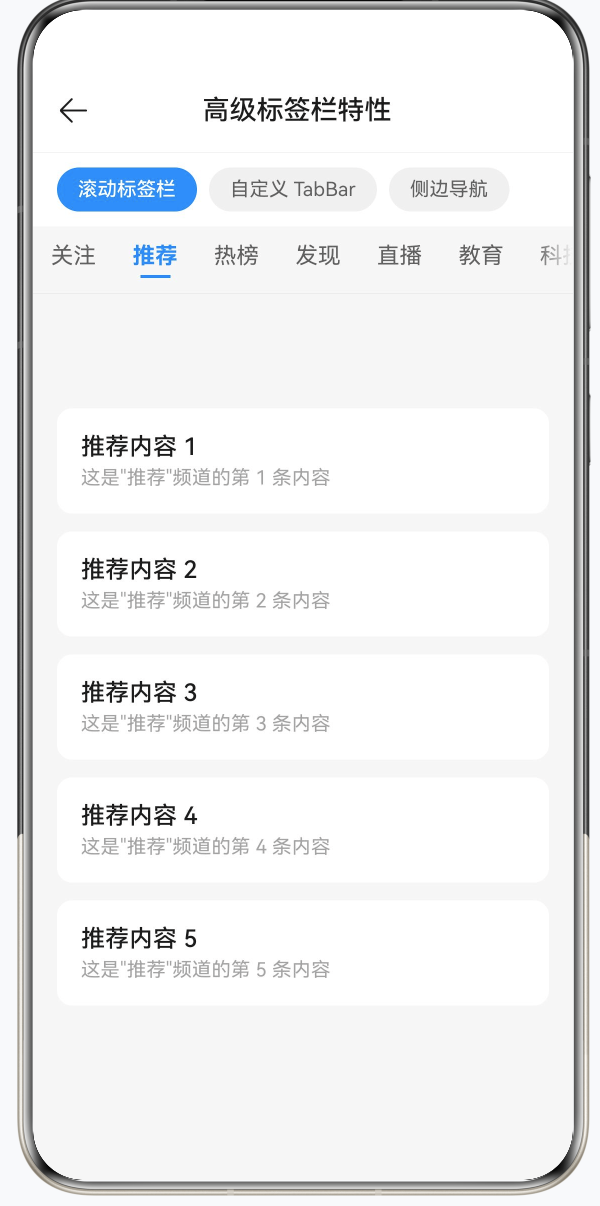
二、可滚动标签栏(BarMode.Scrollable)
2.1 Fixed 与 Scrollable 的区别
Fixed 模式(3-5 个标签,等宽平铺):
+------------------------------------------+
|   关注        推荐        热榜        我的   |
+------------------------------------------+

Scrollable 模式(5 个以上标签,可横向滑动):
+------------------------------------------+
| 关注  推荐  热榜  发现  直播  教育  ... ->  |
+------------------------------------------+
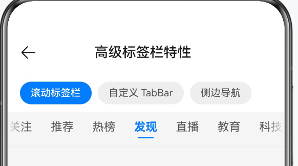
经验法则:3-5 个标签用 BarMode.Fixed,5 个以上用 BarMode.Scrollable。
2.2 自定义 TabBar 样式(@Builder)
系统默认 TabBar 只能设置文字和基础颜色。要实现"选中时加粗 + 底部指示线"的效果,需要用 @Builder 替换默认样式:
@Builder
tabBarBuilder(title: string, index: number) {
  Column() {
    Text(title)
      .fontSize(15)
      .fontWeight(this.currentIndex === index ? FontWeight.Bold : FontWeight.Normal)
      .fontColor(this.currentIndex === index ? '#007AFF' : '#555555')
      .padding({ left: 4, right: 4 })

    // 选中时显示蓝色指示线,未选中时透明
    Divider()
      .strokeWidth(2)
      .color('#007AFF')
      .opacity(this.currentIndex === index ? 1 : 0)
      .width(20)
      .margin({ top: 4 })
  }
  .height(44)
  .justifyContent(FlexAlign.Center)
  .padding({ left: 8, right: 8 })
}
代码说明:
@Builder方法接收title和index两个参数,通过与this.currentIndex比较判断当前是否选中,实现颜色和字重的动态变化。Divider的opacity在选中时为 1,未选中时为 0,而非通过visibility控制,这样布局高度不变,切换时不会产生抖动。
2.3 完整实现
@Component
struct ScrollableTabBarDemo {
  private tabsController: TabsController = new TabsController();
  @State currentIndex: number = 0;
  private tabTitles: string[] = [
    '关注', '推荐', '热榜', '发现', '直播', '教育', '科技', '经济', '读书', '文化'
  ];
  private contentItems: string[][] = [
    ['好友动态 A', '好友动态 B', '好友动态 C', '好友动态 D', '好友动态 E'],
    ['推荐内容 1', '推荐内容 2', '推荐内容 3', '推荐内容 4', '推荐内容 5'],
    // ... 其余 8 组省略
  ];

  build() {
    Column() {
      Tabs({
        barPosition: BarPosition.Start,
        index: this.currentIndex,
        controller: this.tabsController
      }) {
        ForEach(this.tabTitles, (title: string, tabIndex: number) => {
          TabContent() {
            // 内容区:Scroll 包裹列表,支持上下滚动
            Scroll() {
              Column({ space: 12 }) {
                ForEach(this.contentItems[tabIndex], (item: string, i: number) => {
                  Row() {
                    Column() {
                      Text(item)
                        .fontSize(16)
                        .fontColor('#1A1A1A')
                        .fontWeight(FontWeight.Medium)

                      Text(`这是"${title}"频道的第 ${i + 1} 条内容`)
                        .fontSize(13)
                        .fontColor('#999999')
                        .margin({ top: 4 })
                    }
                    .alignItems(HorizontalAlign.Start)
                    .layoutWeight(1)
                  }
                  .width('100%')
                  .padding(16)
                  .backgroundColor('#FFFFFF')
                  .borderRadius(10)
                })
              }
              .padding({ left: 16, right: 16, top: 12, bottom: 24 })
              .width('100%')
            }
            .scrollable(ScrollDirection.Vertical)
            .scrollBar(BarState.Off)
            .edgeEffect(EdgeEffect.Spring)   // 滚动到边界时弹性回弹
            .width('100%')
            .height('100%')
          }
          .tabBar(this.tabBarBuilder(title, tabIndex))  // 使用自定义 Builder
        })
      }
      .barMode(BarMode.Scrollable)    // 标签栏可横向滚动
      .scrollable(true)               // 内容区支持手势左右滑动
      .animationDuration(300)
      .barHeight(44)
      .divider({ strokeWidth: 0.5, color: '#E5E5E5' })
      .onChange((index: number) => {
        this.currentIndex = index;    // 手势滑动时同步更新选中态
      })
      .width('100%')
      .layoutWeight(1)
      .backgroundColor('#F5F5F5')
    }
    .width('100%')
    .height('100%')
  }
}
代码说明:
barMode(BarMode.Scrollable)控制标签栏可横向滚动,.scrollable(true)控制内容区支持手势左右滑动,两个属性相互独立,都需要设置。- 内容区用
Scroll包裹Column,设置ScrollDirection.Vertical为纵向滚动,EdgeEffect.Spring让滚动到底部时有弹性回弹效果,提升手感。 tabIndex作为下标索引从contentItems二维数组取对应的数据,内容与标签一一对应。onChange回调负责在用户手势滑动时同步currentIndex,使@Builder中的激活样式随之更新。
三、完全自定义底部 TabBar(仿微信风格)
3.1 核心思路:隐藏系统 TabBar + 自绘底部 Row
系统 Tabs 的内置 TabBar 在样式定制上有限制,当设计稿对底部导航有特殊要求时,常用的方案是:
- 设置
barHeight(0)将系统 TabBar 高度归零,视觉上完全隐藏; - 在
Tabs下方另外绘制一个自定义Row作为底部导航; - 点击自定义
Row的条目时,同步更新currentIndex并调用tabsController.changeIndex()。
3.2 各 Tab 的内容用 @Builder 分离
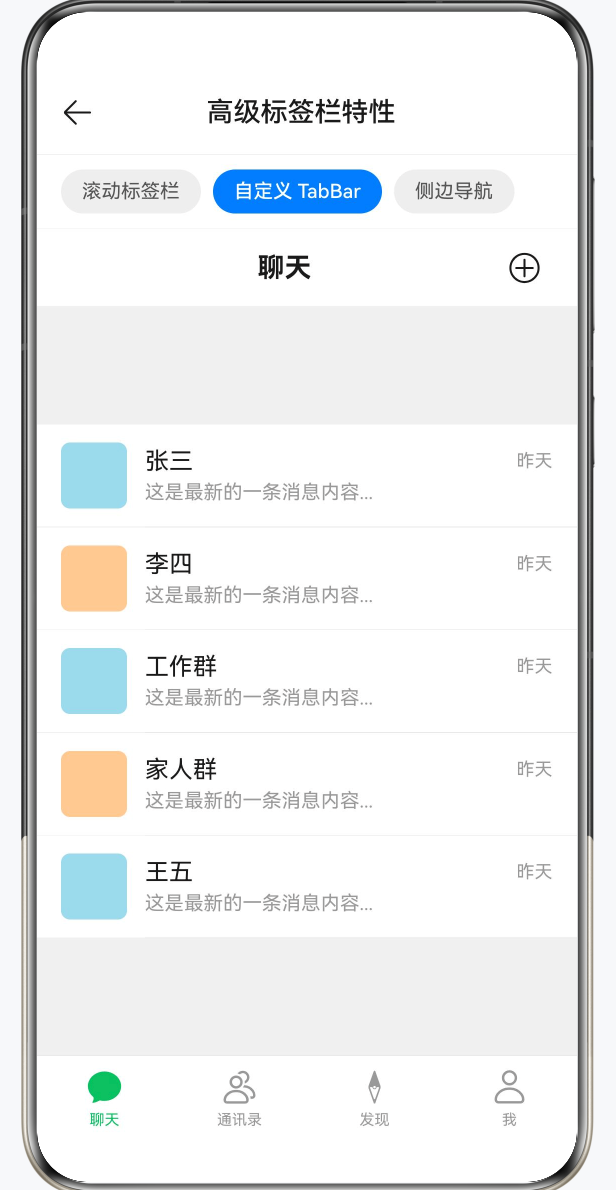
@Builder
chatContent() {
  Scroll() {
    Column({ space: 0 }) {
      ForEach(this.chatList, (name: string, i: number) => {
        Row({ space: 12 }) {
          // 头像占位块
          Column()
            .width(44).height(44)
            .borderRadius(6)
            .backgroundColor(i % 2 === 0 ? '#A8D8EA' : '#FFCC99')

          Column() {
            Row() {
              Text(name)
                .fontSize(16).fontColor('#1A1A1A').layoutWeight(1)
              Text('昨天')
                .fontSize(12).fontColor('#999999')
            }
            .width('100%')

            Text('这是最新的一条消息内容...')
              .fontSize(13).fontColor('#999999')
              .margin({ top: 4 })
              .maxLines(1)
              .textOverflow({ overflow: TextOverflow.Ellipsis })
          }
          .layoutWeight(1)
          .alignItems(HorizontalAlign.Start)
        }
        .width('100%')
        .padding({ left: 16, right: 16, top: 12, bottom: 12 })
        .backgroundColor('#FFFFFF')

        Divider().strokeWidth(0.5).color('#E5E5E5').margin({ left: 72 })
      })
    }
  }
  .scrollable(ScrollDirection.Vertical)
  .scrollBar(BarState.Off)
  .edgeEffect(EdgeEffect.Spring)
  .width('100%').height('100%')
  .backgroundColor('#F0F0F0')
}
代码说明:
- 每个 Tab 的内容通过独立的
@Builder方法定义,结构清晰,不会让build()过于冗长。 - 分割线
Divider用.margin({ left: 72 })缩进,与头像右侧对齐,形成标准的列表分割线样式。 maxLines(1)配合textOverflow: TextOverflow.Ellipsis保证消息预览超长时自动截断显示省略号。
3.3 Tabs 主体与自定义底部导航
build() {
  Column() {
    // 顶部标题栏:标题随 currentIndex 变化
    Row() {
      Text(this.tabData[this.currentIndex])
        .fontSize(18).fontWeight(FontWeight.Bold).fontColor('#1A1A1A')
        .layoutWeight(1).textAlign(TextAlign.Center)

      SymbolGlyph($r('sys.symbol.plus_circle'))
        .fontSize(22).fontColor(['#1A1A1A']).padding({ right: 8 })
    }
    .width('100%').height(52)
    .backgroundColor('#FFFFFF')
    .border({ width: { bottom: 0.5 }, color: '#E5E5E5' })

    // Tabs:barHeight(0) 隐藏系统标签栏
    Tabs({
      barPosition: BarPosition.End,
      index: this.currentIndex,
      controller: this.tabsController
    }) {
      TabContent() { this.chatContent() }
      TabContent() { this.contactContent() }
      TabContent() { this.discoverContent() }
      TabContent() { this.profileContent() }
    }
    .scrollable(false)       // 禁用手势滑动,避免与自定义逻辑冲突
    .barHeight(0)            // 系统 TabBar 高度为 0
    .animationDuration(200)
    .layoutWeight(1)
    .onChange((index: number) => {
      this.currentIndex = index;
    })

    // 自定义底部 TabBar
    Row() {
      ForEach(this.tabData, (title: string, index: number) => {
        Column() {
          SymbolGlyph(
            this.currentIndex === index ? this.activeIcons[index] : this.icons[index]
          )
            .fontSize(26)
            .fontColor(this.currentIndex === index ? ['#07C160'] : ['#999999'])

          Text(title)
            .fontSize(10)
            .fontColor(this.currentIndex === index ? '#07C160' : '#999999')
            .margin({ top: 3 })
        }
        .layoutWeight(1)
        .height(56)
        .justifyContent(FlexAlign.Center)
        .onClick(() => {
          animateTo({ duration: 200 }, () => {
            this.currentIndex = index;
            this.tabsController.changeIndex(index);  // 驱动内容区切换
          });
        })
      })
    }
    .width('100%')
    .backgroundColor('#FFFFFF')
    .border({ width: { top: 0.5 }, color: '#E5E5E5' })
  }
  .width('100%').height('100%')
  .backgroundColor('#F0F0F0')
}
代码说明:
barHeight(0)必须设置,否则系统 TabBar 会占据空间并出现在自定义 Bar 上方。- 点击自定义 Bar 时需要同时做两件事:
this.currentIndex = index(更新状态变量,让图标和颜色刷新)和tabsController.changeIndex(index)(驱动 Tabs 内容区实际切换)。缺少其中任一步,都会造成底部 Bar 与内容区不同步。 animateTo将两个状态变更包在同一次动画事务中,保证底部图标和内容区在同一帧切换,避免视觉撕裂。- 顶部标题
Text(this.tabData[this.currentIndex])会随选中项自动更新,实现了类微信"当前 Tab 名称作为页面标题"的效果。
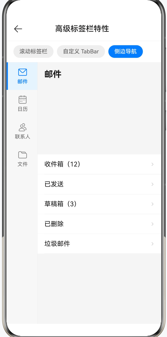
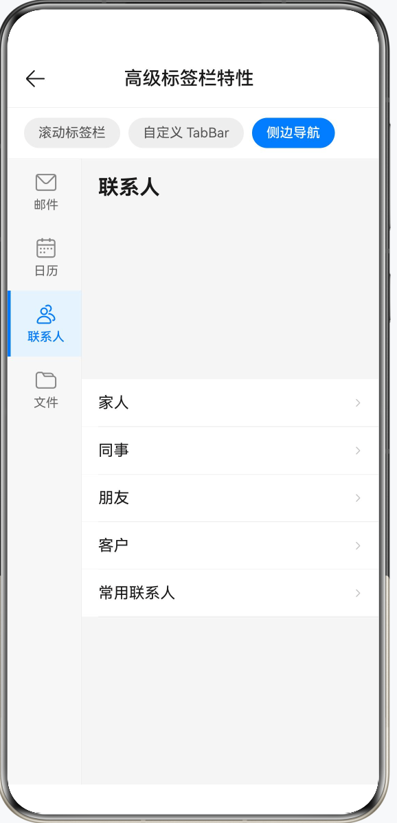
四、侧边导航栏(图标 + 文字 + 指示边框)
4.1 布局结构
左侧用自定义 Column 实现,宽度固定为 72px;右侧用 Tabs(隐藏 TabBar)承载内容,layoutWeight(1) 自适应剩余宽度。
4.2 侧边条目:@Builder sideTabItem
@Builder
sideTabItem(title: string, icon: Resource, index: number) {
  Column({ space: 4 }) {
    SymbolGlyph(icon)
      .fontSize(22)
      .fontColor(this.currentIndex === index ? ['#007AFF'] : ['#888888'])

    Text(title)
      .fontSize(12)
      .fontWeight(this.currentIndex === index ? FontWeight.Medium : FontWeight.Normal)
      .fontColor(this.currentIndex === index ? '#007AFF' : '#666666')
  }
  .width('100%')
  .height(64)
  .justifyContent(FlexAlign.Center)
  .backgroundColor(this.currentIndex === index ? '#E8F3FF' : Color.Transparent)
  .border({
    width: { left: 3 },
    color: this.currentIndex === index ? '#007AFF' : Color.Transparent   // 选中时左侧蓝色边框
  })
  .onClick(() => {
    animateTo({ duration: 250, curve: Curve.EaseOut }, () => {
      this.currentIndex = index;
      this.tabsController.changeIndex(index);
    });
  })
}
代码说明:
- 选中效果由三层叠加实现:蓝色图标和文字 + 浅蓝背景
#E8F3FF+ 左侧 3px 蓝色实线边框,视觉上形成"当前选中条目高亮并凸显"的效果。 .border({ width: { left: 3 }, color: ... })仅设置左边框,其余三边宽度为 0,精确控制只在左侧显示指示线。animateTo指定了curve: Curve.EaseOut,使切换动画有"快进慢出"的质感。
4.3 完整 build 结构
build() {
  Row() {
    // 左侧自定义导航栏
    Column() {
      ForEach(this.sideTabs, (title: string, index: number) => {
        this.sideTabItem(title, this.tabIcons[index], index)
      })
    }
    .width(72)
    .height('100%')
    .backgroundColor('#F7F7F7')
    .border({ width: { right: 0.5 }, color: '#E5E5E5' })

    // 右侧内容区(Tabs 隐藏系统 TabBar)
    Tabs({
      barPosition: BarPosition.Start,
      index: this.currentIndex,
      controller: this.tabsController
    }) {
      ForEach(this.sideTabs, (title: string, tabIndex: number) => {
        TabContent() {
          Column() {
            // 内容标题行
            Row() {
              Text(title)
                .fontSize(20).fontWeight(FontWeight.Bold).fontColor('#1A1A1A')
            }
            .width('100%')
            .padding({ left: 16, right: 16, top: 16, bottom: 12 })

            // 可滚动列表
            Scroll() {
              Column({ space: 0 }) {
                ForEach(this.tabContents[tabIndex], (item: string) => {
                  Row() {
                    Text(item)
                      .fontSize(15).fontColor('#1A1A1A').layoutWeight(1)
                    SymbolGlyph($r('sys.symbol.chevron_right'))
                      .fontSize(14).fontColor(['#C0C0C0'])
                  }
                  .width('100%')
                  .padding({ left: 16, right: 16, top: 14, bottom: 14 })
                  .backgroundColor('#FFFFFF')

                  Divider().strokeWidth(0.5).color('#E5E5E5').margin({ left: 16 })
                })
              }
            }
            .scrollable(ScrollDirection.Vertical)
            .scrollBar(BarState.Off)
            .edgeEffect(EdgeEffect.Spring)
            .layoutWeight(1)
            .width('100%')
          }
          .width('100%').height('100%')
          .backgroundColor('#F5F5F5')
        }
      })
    }
    .barHeight(0)
    .scrollable(false)
    .animationDuration(300)
    .layoutWeight(1)
    .onChange((index: number) => {
      this.currentIndex = index;
    })
  }
  .width('100%').height('100%')
}
代码说明:
- 右侧
Tabs通过barHeight(0)隐藏系统 TabBar,scrollable(false)禁止手势横向滑动,所有切换都由左侧点击驱动,避免用户误操作。 - 右侧内容区每个
TabContent内部是"标题行 + Scroll 列表"的结构。Column设置了height('100%'),Scroll用layoutWeight(1)填充标题行以下的所有剩余高度,保证列表区域可以正常滚动。 tabContents是二维数组,tabIndex作为下标取出当前 Tab 的内容项,与左侧导航的数量一一对应。
五、三种场景对比
| 场景 | 推荐方案 | 关键属性 |
|---|---|---|
| 标签数量 5 个以上 | BarMode.Scrollable | .barMode(BarMode.Scrollable) + .scrollable(true) |
| 需要代码驱动切换 | TabsController.changeIndex | 同时更新 currentIndex 状态变量 |
| 高度定制底部导航 | barHeight(0) + 自绘 Row | .scrollable(false) 禁止手势冲突 |
| 侧边导航 | 自定义左侧 Column + Tabs | barHeight(0) + layoutWeight(1) |
六、TabsController 使用要点
三个示例都用到了 TabsController,总结四个核心注意点:
| 注意点 | 说明 |
|---|---|
| 索引范围 | 必须在 [0, TabContent 数量 - 1] 内,越界调用会被忽略 |
| 动画 | changeIndex 本身不带动画,需用 animateTo 包裹 |
| 状态同步 | 调用 changeIndex 后必须同步更新 currentIndex,否则自定义 Bar 样式不刷新 |
| 控制器独立 | 一个 TabsController 只能绑定一个 Tabs,不能多组件共用 |
总结
这三个标签栏进阶用法解决的其实是同一类问题:系统默认能力不够用时,怎么拿回控制权。可滚动标签栏让十个以上的分类也能整洁呈现,完全自定义底部 Bar 让设计稿中任何形态的导航都能落地,侧边导航则打开了从手机到平板的布局适配思路。理解这三种模式之后,市面上绝大多数 App 的导航结构都有了对应的实现方式。代码写多了会发现,灵活性往往来自"隐藏系统提供的,自己重新画一遍",HarmonyOS 的 Tabs 给了足够的扩展空间,用好这些接口,导航部分基本不会卡壳。
转载自CSDN-专业IT技术社区
原文链接:https://blog.csdn.net/qq_33681891/article/details/160382964